The Voice of Innovation
C&C is a Marketing and PR agency in Latam, representing some of the most high-end enterprises in the world. When creating their digital presence, they wanted the work to speak for itself while communicating their innovative approach and celebrating their exclusive clientele.
Client: C&C
Format: Website
With: Paperplane.co
Live Site: www.cyccomunicaciones.co
Year: 2019
Role:
- UX - UI
- Visual Designer
- Art Direction
Tools:
- Adobe XD

Divine Proportions
I was in charge of creating the menu. As a strategy, our goal was to communicate a sense of accomplishment by highlighting the work across various sections, including the menu. I segmented the menu following the divine proportions curve to give a sense of hierarchy to the content and allow for different content types. This allowed smooth navigation between categories and case studies, but beyond this, it also empowered the client to highlight new work without having a "new" section, which they were trying to avoid as project turnaround was slow.


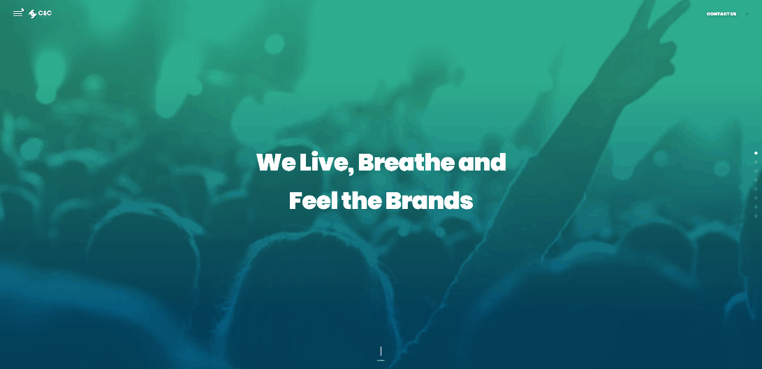
Image Layout
Our goal was to make the site as visually rich as possible. We came up with the concept of a partial reveal window, which would create a sense of curiosity when paired with the client's name.
To arrive at the correct overlay, I used low-fidelity sketches over generic photographs to find which would lend themselves better to different formats.

Image Guidelines
Given that the team was also creating the branding, we provided imagery guidelines to help the brand keep a consistent visual identity and statement across the site. We recommended images that included people to communicate lifestyle, optimism, and users vs. services and corporations.


Brand Guidelines
The logo is the first impression of a company’s brand. It is also the simplest and most efficient way to portray a brand. Being a communication agency, it was crucial that the logo properly communicated who they were and their vision.
The graphic design team created a logo that translated their motto into a slogan of collaboration and community, also exemplifying their business objectives of PR and Marketing. Paperplane provided clear guidelines for how and where to use the logo for maximum effectiveness.

Logo Variations


Sizing


Improper use of Logo

Don't bring items close

Don't change icon colors

Don't squeeze/stresh logo
Color and Typeface
We developed brand guidelines including color palettes and typefaces to establish a strong visual hierarchy, setting the overall tone of the website and creating a good graphic balance.


Text Bosy and Short Text
TITLES
Subtitles
Text Blocks
Short Text

Take Aways
Conclusion
This project was particularly exciting for me, as I could apply concepts I teach for Industrial Design. When designing a product, you can look at its elements with a hierarchy, and if this hierarchy is defined properly, it creates a sense of visual balance. The menu and the image layout were an excellent opportunity to apply this concept further to create a sense of discovery and movement.
Working with the Paperplane graphic design team in developing the brand guidelines was very instructive. I furthered my knowledge of visual scale with logos and typography in building comprehensive brand DNA guidelines.